
In December of last year, the world got to see Pantone’s colors for 2021 for the first time. Since 1999, Pantone has been choosing a color of the year, subsequently inspiring architects, advertisers, and designers across the globe. However, this year was a little different. Pantone, for the second time ever, chose to go with two colors instead of one. But what intrigued those of us at Kryton more was that their chosen colors represented Kryton’s own colors of yellow and gray.
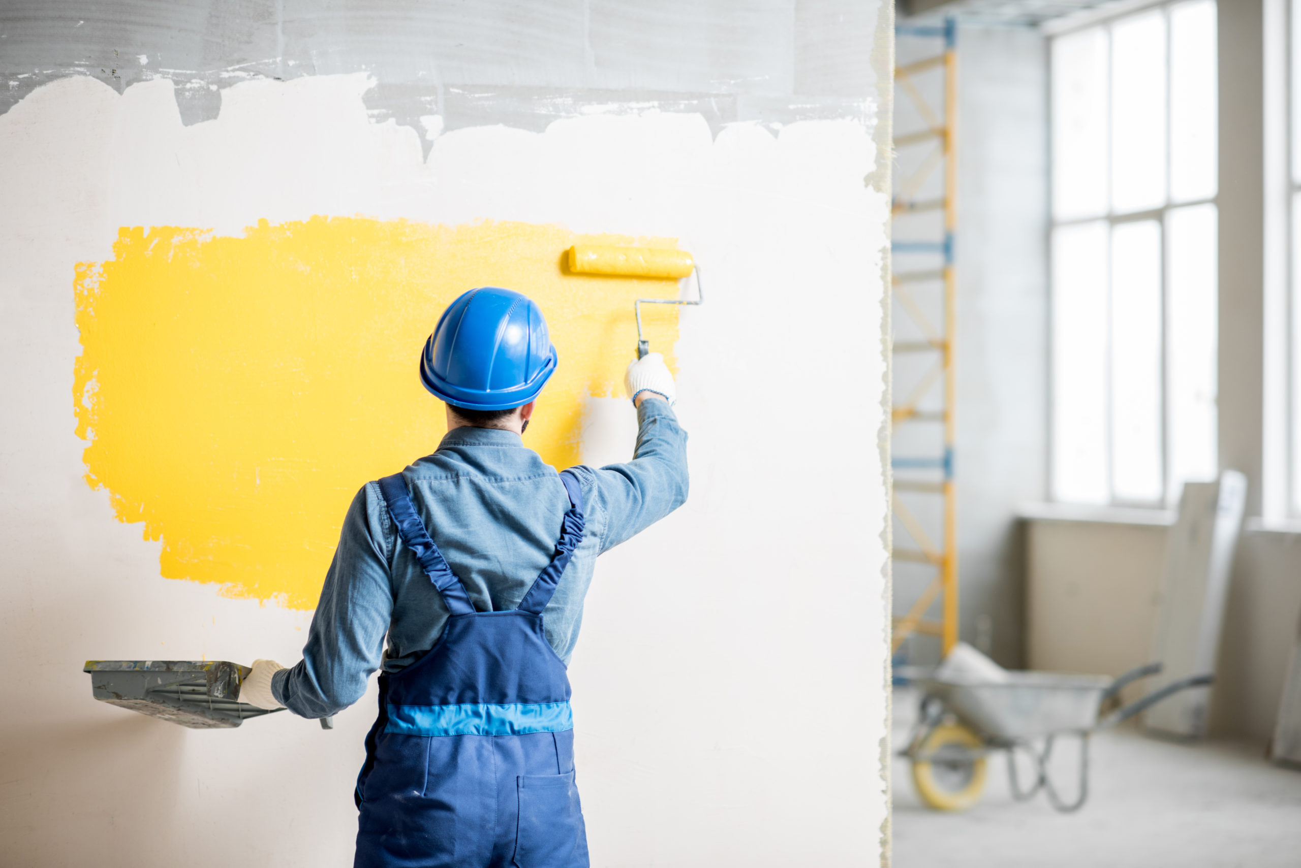
When Kryton chose those colors for rebranding, it was not just to capture interest with the eye-catching highlight of yellow against gray. It was also to give people that feeling of reliability and strength that construction so often reflects through the safety of yellow hard hats and the durability of gray concrete foundation. (You can easily see this theme run throughout our website and our blog.)
Pantone clearly had a similar train of thought for the colors. On their website, they mentioned that people feel the need to know that better times will come. And that’s why they chose yellow and gray. Both colors provide a feeling of stability, with yellow bringing a sense of warmth and optimism and gray adding a practical, rock-solid side.
We’re not the only ones who recognized the appeal of these colors either. A number of architect publications have published articles on the colors for 2021, including the Architectural Digest.
Does that mean that Pantone’s colors have an impact on architecture? While color selection is not the first or only focus for an architect, we here at Kryton believe that there may be good reason to give it its 15 (or more!) minutes of fame.

It’s True That Colors Aren’t Usually an Architect’s Main Concern
As an associate of Cambridge Architectural Research Ltd. points out, color, more specifically, exterior color, has always been a part of architecture, but its role has been particularly small. He goes on to mention that even empirical research on exterior color is limited with ambiguous results to show for it. An author from ArchDaily makes it even clearer that color in general is something that some architects tend to be wary of. And even the National Council of Architectural Registration Boards suggests that architects and architectural schools seem to avoid focusing on it as a topic.
But why is that?
Well, all three sources suggest a number of reasons.
For instance, the author from ArchDaily mentions that architectural instructors often teach architects to focus more on architectural elements like form, space, and materials. After all, as he suggests, it’s easier for the owner of a building to give the structure a new color than it is to fix anything structural like placement.
Not to mention, the choice of color can be a highly subjective one. As the architectural consultant and author Frank Mahnke puts it, it “is a sensory perception, and as any sensory perception, it has effects that are symbolic, associative, synesthetic, and emotional.” Each of those effects is going to be somewhat different based on the person viewing the color and what cultural associations they assign to it. That can make it difficult for an architect to defend their choice. So it might be easier to stick to the more popular exposed finishes.
And in the case of exterior colors, there is another practical reason to keep them less colorful. Outdoor environments can cause a lot of wear and tear, making exterior colors fade. Depending on the shade of color, that fading can be very obvious. In light of that, architects prefer to use durable materials like concrete blocks, bricks, or terracotta that can withstand the wear. These materials also happen to come in colors that don’t show any obvious fading, such as gray, beige, and other earthy shades.
But Colors Can Significantly Impact a Building’s Design
Despite all the challenges of working with color, it can still be a highly effective design tool. In fact, with the right strategy, the use of color in architecture can help turn a building into an architectural icon, positively impacting the perception people have of the building and its design.
To See Why, Let’s Dive a Little into Color Psychology
According to a literature review conducted by the Cyprus International University and Zedrock and Herman Architecture, it’s true that a single color can be interpreted in a variety of ways. For instance, people in China might associate white with sadness due to its use during their mourning periods. At the same time, many Europeans will view it as a color for purity and cleanliness. In short, color will always have a subjective quality that may make some architects hesitant about the reception of their chosen color.
However, the literature review also notes that there is a more universal and psychological aspect to color. Known as color psychology, it is considered to be the result of how the electro-magnetic radiation of light affects the moods and behaviors of all people in a similar manner.
It does this by affecting a specific part of the brain in people known as the hypothalamus. To do that, light first enters a person’s eyes. The retinas within those eyes then convert the light into electric signals, which the hypothalamus goes on to interpret.
That can significantly affect how a person physically reacts to seeing certain colors as the hypothalamus is in charge of a number of important bodily functions. These functions include the ability to change body temperature, appetite, sleep, and behavior. As a result, color not only derives a personal response from someone. It also derives a physical response.
And it’s a response that is generally similar across all cultures, ages, and genders. So if architects take care to keep that in mind, they could design a building that is not only visually pleasing but also physically comforting.
With This Tool at Their Disposal, Architects Can Change How People React to a Building with Just Colors
Of course, architects first need to have an idea of what effects certain colors bring. Consider the impact of the following colors:
Red — As a color with the longest light wavelength, red tends to be seen as a strong, attention-grabbing color. And that intensity can generate a fair amount of stimulation. In fact, in some cases, the color can be so stimulating that it will activate a person’s fight or flight instinct or increase their blood pressure. As a result, many people consider it to be a color for strength, energy, warmth, and even aggression.
Yellow — Considered to be one of the most psychologically strong colors, yellow is often perceived as optimistic and positive no matter the shade. For instance, a light pastel yellow will give off a childlike feel. Canary yellow is seen as more delicate and soft. And ambered yellow radiates a calmer, warmer feel.
Green — A color with a lower light wavelength, green contrasts red by appearing more emotionally calming. One researcher suggests that shades like green are particularly relaxing because they reflect color found in nature. It is also useful in helping people become accustomed to new areas. However, depending on its use, green can also be seen as too bland or demoralizing.
Blue — Much like green, blue is a color with a low light wavelength and is also seen as relaxing. There has even been some evidence that it can lower blood pressure.
Depending on the intensity of a single color like those previously mentioned or a combination of multiple colors applied to the inside or outside of a building, visitors may find themselves feeling varying degrees of stimulation.
They Can Even Provoke Both Positive and Negative Physical Reactions
If visitors see an individual color that is overly saturated, a color combination with too many colors, or one with too few that don’t match well, they’ll likely feel overstimulated. In turn, that can cause a number of symptoms, including:
Changes in breathingAn increase in pulse rateHigher blood pressureMore muscle tensionA possible rise in susceptibility to infection
On the other hand, if visitors see a less saturated color or color contrast, monochromatic color combinations, achromatic colors, or a monotonous color contrast, they’ll probably feel understimulated. When that happens, visitors are more likely to feel the following:
RestlessIrritableExcessively emotionalDistracted
It takes a particular balance of saturation and color combination to evoke the desired reaction in a person. But it’s not an impossible task! In fact, back in 2007, the University of Texas already discovered that depending on how sensitive a person is to their environment, certain colors could help improve their work performance. For those moderately sensitive to their environment, a blue-green interior seemed to boost their performance the best. White and red interiors were less impactful. At the same time, those who were less sensitive to their environment were able to work in any of the colored interiors with little issue.
So, Where Do Pantone’s Colors for 2021 Fit into All of This?
Pantone doesn’t just arbitrarily choose their color for each year. There’s actually a fair amount of observation that goes into it. They know how color psychology plays an important role in a color’s reception. It’s also clear that they know how much meaning people assign to these colors. After all, there is never one color that they popularize each year. So they look to color psychology while observing industry color trends to explain the popularity of each year’s different color.
But how do they do they go about it?
They Lay Out Which Colors Are Attracting the Most Attention in a Given Year
According to Pantone’s executive director, Leatrice Eiseman, the fashion industry is often the first indicator of popularity for certain colors. However, Pantone doesn’t just observe that industry. They also look at the colors found in films, cars, art, and many other areas. Employees for the company also travel around the world to places like Milan, Paris, New York, and Dubai to see the most popular colors found there.
Eventually, they all meet up to discuss what they’ve observed. Then, they try to narrow down which color seems to attract the most attention overall.
Of course, this process isn’t perfectly accurate. After all, in 2013, their choice of emerald green was a love-hate one. Not everyone really agreed with it, but there was still an overall positive response surrounding the color. So Pantone still offers a way to get a good feel for an almost universally appealing shade of color.
That Can Give Architects Insight into How to Design with Colors
Pantone doesn’t just make a choice that reflects overall sentiment on color. As a company that holds some global authority on color, Pantone can affect how others see certain colors. So the company’s color of the year can influence how consumer products are designed for that year and many years later.
With that in mind, architects may see their own clients request or find interest in the use of Pantone’s chosen colors. For example, ArchDaily published an article in 2020 already showing a number of architectural projects reflecting Pantone’s colors for 2021.
So while color trends can be fickle, they can also lead the way to satisfied clients and increased recognition.
They’re an innovative tool that has much to offer to architects. And as ardent supporters of such innovation, we here at Kryton want to make sure architects can use that tool and more to the best of their ability. That’s why we work with architects and builders to determine what Smart Concrete solutions work for their design needs. So if you’re looking to add color to the mix and worry about maintaining the integrity of your concrete structure, our admixtures offer a great solution for either colored or painted concrete. See for yourself, and discover how we can help you add a little color and more to your project!

The post Pantone’s Colors for 2021 and What That Means for Architecture appeared first on Kryton.